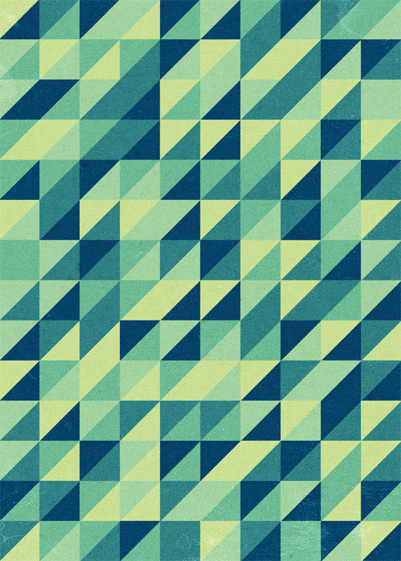
Follow this step by step Illustrator tutorial to create the popular
retro style pattern design made up of lots of colourful squares and
triangles. The process is pretty simple, making this a good tutorial for
newcomers to Adobe Illustrator. We’ll be using tools to accurately
align our elements, then see how the Pathfinder can easily create custom
shapes.
The
pattern we’ll be creating is this cool retro inspired somewhat mosaic
like design. The mix of squares and triangles along with the limited
colour palette attracts the eye with cool illusions.
Open
up Adobe Illustrator and create a new document. Select the Line tool
and draw a vertical line down the left border of the artboard, then hit
the Enter key to bring up the Move options. Enter 20mm in the Horizontal
field then click the Copy button.
Repeatedly press CMD+D to repeat the last transformation until the width of the artboard is filled with evenly spaced lines.
Repeat
the process, but this time with a horizontal line. In the Move options
window enter 20mm in the Vertical field then repeat the transformation
to fill with the artboard with a grid pattern.
Next,
draw a diagonal line at 45 degrees across the artboard. Be sure to make
this line long enough to cross the whole artboard, even at its widest
point.
Zoom right in and toggle outline mode (CMD+Y) and carefully align the diagonal line so it accurately intersects each grid point.
Hit
Enter to bring up the Move options and enter 20mm in both the
Horizontal and Vertical fields. Repeat the transformation to make
duplicates to cover the artboard.
Draw
a selection around all objects then hit the Divide option from the
Pathfinder tool palette. This will split all the lines into individual
shapes.
Right
click and select Ungroup to split up the objects then draw a selection
and delete any shapes beyond the edge of the artboard.
Now let’s add some colour! First we’ll need a basic palette to work from, here I’ve picked out a mix of greens/blues from ColourLovers.com.
Begin by randomly selecting a bunch of shapes while holding the Shift
key, then add the colour fill using the Eyedropper tool on your
temporary swatch.
Continue selecting empty shapes then give them a colour fill using the next swatch in the palette.
As more colours are added the design really starts to take shape…
…until
eventually the whole design is filled with colour. Make any adjustments
if there’s any dense areas of a single colour, or sparse areas that
lack one of the other swatches.
The
pattern itself is complete, but it wouldn’t be a Chris Spooner design
tutorial without a texture overlay! Copy and paste the design into
Photoshop and open up a texture file.
Desaturate the image and set the blending mode to Soft Light, then
adjust the opacity to tone down the effect of the texturing.
The
texture overlay just helps add that tactile feel to the design to help
remove the flat appearance of digital graphics. The uses for this kind
of pattern are endless, it could be the base of a business card design, a
skateboard deck design or even just as a printed poster.
Drawing vector silhouette figures using the pen tool is a long and painful process. However, with Illustrator’s Live Trace effect, you can now create silhouettes with ease. In this Illustrator tutorial, I am going to teach you how to prepare your images in Photoshop for Live Trace. Then, we will experiment with various Live Trace settings to create our silhouette. After reading this, you will be able to create better looking silhouette figures.
1. Tracing With Live Trace
To begin tracing using auto trace, we will need to have a high resolution photo. This gives a better and more detailed trace than a low resolution photo. Also, you will need to choose photos that have a white background or strong contrast with the background for auto trace to work. For this tutorial, I have download this free stock photo from stock.xgn which can be found here.
Go File>Place and place the photo on the artboard. Select the photo and click Live Trace. Simple Trace will be selected as default for the trace. You will notice that there are 2 problems with the trace. First, the darker tones of background sky is being traced and secondly, the hands of the girls are missing. Click the Options icon beside Preset and try adjusting the Threshold settings. You will realise that this can’t be fixed with it.
1. Isolate the Background to White
The way to solve this is to make the background white. This will will give you a better trace. Open up the photo in Photoshop and select the Magic Wand. Set the Tolerance of the Magic Wand to 32 and select the background.
Fill the background with white.
We will need to darken to photo to remove all the details on the t-shirt to get a perfect black silhouette. Go to Image>Adjustments>Levels and drag the midtone color to the far right.
This is our final image after we have adjusted. It looks ugly right now, but trust me that the silhouette is going to be fine. Save the photo as jpg again and replace it in illustrator again.
Now, select Live Trace again for the photo and you can instantly see the difference.
Open up the Tracing Options again to tweak the trace. Increase the Threshold to 200 to remove the white areas on the girl. I have also increased the blur to 0.2px to smooth the edges. Also check Ignore White to remove the white background from the trace. Experiment with other settings to see which settings give the best results. Below is an explanation of each features for Live Trace.
Preset – Preset contains a set of settings for some common traced effect. It is a good place to start to see which settings gives you the best effect before you tweak the others.
Mode – Choose you color settings (black and white, grayscale or color)
Threshold – The value to separate black to white. Lighter pixels are converted to white and darker pixels are converted to black.
Palette – Choose automatic color selection or you can define your own color palette.
Max Colors – Maximum amount of colors used to define the palette.
Output to Swatches – Save your color palette to swatches.
Blur – Amount of gaussian blur applied to your image. Higher value will smooth out edges.
Resample – Changes the resolution of the image. Set it lower to speed up computer performances.
Fills – Check to render Fill.
Strokes – Check to render stroke.
Max Stroke Weight – Specifies that anything larger than this value will be considered a fill.
Min Stroke Length – The minimum size of a stroke allowed.
Corner Angle – The sharpness of the turn to be considered as an angle.
Ignore White – Leave white fill as transparent.
Preview – Toggle this to turn on live preview. Always turn it on to see your traced effect.
This is our final traced effect. There are some white areas on the first figure that needs to be cleaned up.
If you are using Illustrator CS4, you can select the Blob Brush and paint over it to cover up the white areas. Or else, you can use the Direction Selection Tool to delete the unwanted paths.
To clean up jagged edges, select the Smooth Tool and retrace the path to smooth it.
Here our final black vector silhouette. Now you can add in your Illustrator background effect.
This tutorial will teach you how to create a beautiful maple leaf tree from scratch using Illustrator. We will use the Pen tool to create the leaf and create a custom brush to make many leaves of different sizes.
The following steps will help you create the final output for the maple tree, as shown in the figure above.
1. Choose the Pen Tool from the Tools panel on the right in Illustrator. Use the selected Pen Tool to create the following shape of the maple tree.
2. Select the Gradient Tool from the Tools panel. Double- click on the Gradient Tool icon in the Tools panel; the gradient tool properties are displayed, as shown in Figure below.
3. Choose Radial from the Type drop-down list and add the following RGB values to the left and the right node. Right node: 240,88,34 Left node: 251,174,23
4. Apply the gradient in the maple leaf to get the effect as shown in the Figure below.
5. Next, use the Pen Tool and create the step and the leaf stroke as shown in Figure below.
6. Press CTRL + a to select all the objects created on the stage area and then press CTRL + g to group all of them together. Next, create multiple copies of the leaf and add different color shades to them to get the effect, as shown in the figure below.
NOTE:
You can add gradient to the leaves to make it look more realistic, but for this tutorial we will be using solid colors for the tutorial. Add solid colors to the leaves to get the effect as shown in the figure below.
7. Choose CTRL + a to select all the objects on the stage area and then CTRL + g to group them together. Scale the leaves to 20% of its original size.
8. Select the leaves and choose Window > Brushes from the main menubar; the Brushes window is displayed, as shown in the figure below.
9. Choose the inverted triangle icon on the top right hand corner of the window; a flyout is displayed. Choose New Brush… from it; the New Brush window is displayed.
10. Choose Scatter Brush radio button and next choose the OK button; the Scatter Brush Options window is displayed, as shown in below.
11. Add the following parameters in the Scatter Brush Options dialog box.
Size: Random between 76% – 134%
Spacing: Random between 65% – 119%
Scatter: Fixed – 6%
Rotation: Random between 41° – 110°
Enter all these values to as shown in Figure below and choose the OK button. Note: You can also set these values as per your need and requirement.
12. Next, choose the Pen Tool from the Toolbar and draw the trunk of the tree as shown in Figure below.
13. Next, create a new layer to make the leaves for the tree and choose the Brush Tool from the Toolbar. Next, select the leaf brush pattern that you from the BRUSHES panel and draw an outline of the leaves selected to as shown below.
14. Next fill in the empty space in the between to fill in the leaves as shown in the figure below to get your tree completed.
15. You can now use this tree to create a wallpaper image using your skills and creativity similar to the following image in the Figure.
Start with the word you'd like to design around. I'll be using the make-believe word "AQUIO," which, in our case, is a hydro-electric energy company. Grab a sketchpad and draw some shapes that remind you of the word. These shapes will be starting points for what will "house" our type. Try and push the boundaries, you never know what pieces might make it into your final design.
2) Brainstorm
Open up Illustrator and explore several different typeface options. If you don't have many fonts, I suggest heading over to losttype.com and picking up a few. Here you can see some options that I've made for myself. After looking over what I've got, I think I like the third one on the right, although I think it's a little tall. Let's make some adjustments!
3) Create outlines
I'm using Mensch by Morgan Knutson but for what I've got in mind, I think that the letters are a bit tall and I don't like the "A" in this scenario. Increase your text size, then create outlines by selecting it and hitting ⌘+shift+O or by Type > Create Outlines.
4) Customise the lettering
Delete the "A" and highlight the anchor points on the top half of the text with your direct selection tool. This font works well because it's got vertically straight sides. I'm a nudger, so I use shift+down arrow to make the text a little less condensed but you could drag the points down with your mouse – just make sure you hold the shift key to keep them vertically in line.
5) Create new letterforms
Duplicate the "U" and move it to the left of the "Q"; this will be our new "A". Object > Transform > Reflect it horizontally – if you have it selected, you can also right-click on it and quickly access the Transform > Rotate palette. Because we want to be consistent with the typeface, duplicate the "I", rotate it 90° and bring it over to the new "A" to create a crossbar.
6) Learn to kern
Squish your new crossbar in so that it fits inside the stems of the "A". Find a suitable height for the crossbar and group (⌘+G) or Pathfinder > Unite the two shapes that create your new "A." Position it amongst the other letters until your kerning feels appropriate.
7) Begin making the shape
Now, let's look back at our sketches and choose a shape to build. Normally, I'd do two or three for a client but for our purposes, just creating the droplet shape will do. When making a logo, it's best to start with black and white, using negative space to build a shape that can work with just one colour. Let's start with a circle – press L to quickly access your ellipse tool and hold shift while drawing it to make it perfectly round.
8) Make a droplet
Select the top anchor point with your direct select tool and move it up. Switch to your pen tool (P) and hold option – this quickly accesses the convert to anchor point tool. Click the point you just moved to remove the bezier points.
9) Clean up the shape
The shape is a little imperfect, so grab the top handle of the rightmost point and move it up. Place a guide by dragging down from your ruler (turn it on with ⌘+R) and line it up with that top handle – reason being, we want the other side to be perfectly symmetrical. Move the left anchor point's handle up to the guide. Apply a thick white, outside stroke to your new droplet shape.
10) Frame your lettering
Now draw a black rectangle around your letters (I've also spaced mine out a bit more). Select your letters and change their fill colour to white, then move them in front of your black rectangle with ⌘+X then ⌘+F. Apply the same white, outside stroke (from the droplet) to the rectangle, and move it, along with your letterforms, on top of the droplet. If it looks like it's behind the droplet, move it above the droplet in the layers palette or use ⌘+X then ⌘+F. Once everything feels good, duplicate your black rectangle and move it straight up and out of the way (it's going to be our "ribbon" shape later on).
11) Begin creating the ribbon
Select your rectangle behind your letters and Object > Path > Outline Stroke. Then group it with your letters by selecting both and pressing ⌘+G. With your new group selected, Effect > Warp > Arc about 15°. With both still selected, Object > Expand Appearance and then ungroup them with ⌘+shift+G. Return to the black rectangle you moved out of the way earlier and make it a little wider via the bounding box. Add anchor points to the middle of each side (smart guides will help you align them perfectly) and nudge each one towards the middle of the shape to create a "ribbon".
12) Begin setting up your completely flat shape
Turn off the stroke on your "ribbon" shape and apply the same arc effect by pressing ⌘+shift+E (or Effect > Apply Effect). Move it behind your droplet shape and Object > Expand Appearance. Select your droplet, Object > Path > Outline Stroke, and then duplicate it (⌘+C then ⌘+F). With the new droplet still selected, Pathfinder > Unite (this should give you an all white droplet on top of your other one). Select both the white droplet and your "ribbon" and Pathfinder > Minus Front.
13) Slice and dice your shapes
Select the original black banner (not the text) and its white stroke and ⌘+C, then ⌘+F, then Pathfinder > Unite. Select this white banner and the droplet behind it and Pathfinder > Minus Front. Direct select the white stroke around the banner and delete it with the delete key.
14) Clean up the details
Zoom into your rightmost "ribbon" piece and create a new anchor point along its left side with the pen tool. Move this anchor point next to the bottom right corner of the main banner shape. Remove the handles from the new anchor point as well as the one to its bottom left (in the same shape) by clicking each point with the pen tool while holding option. Direct select both the newly created anchor point and then the bottom right anchor point of the main banner shape (in this order!) and horizontally and vertically align the anchor points using the Align palette. Repeat this process on the left side.
15) Merge your shapes
Select the three banner pieces and Pathfinder > Unite. If for some reason, you can't see your text, just move this new shape below the text in your layers palette. You should now have only three shapes – the text, the banner, the droplet.
16) Finish up with colours
We now have a fully flat logo that is ready for any printer and can be easily manipulated for a one-colour or multi-colour version. Try out some different color combinations and find something you like.
This is only the beginning of what the logo could look like but, in general, simple is best!