Wednesday, May 30, 2012

Logo Design Process For Vivid Ways

0 comments
I recently finished up a project with Scott McIntyre of Vivid Ways and Jon Phillip of Spyre Studios. My part in the project was to work on a new logo design for the Vivid Ways website and brand. Here’s my design process and a walkthrough of how the final logo is created in Adobe Illustrator.
Vivid Ways Logo
Vivid Ways is a new blog focusing on the topic of personal development and colourful living, it aims to inspire and encourage readers through ideas and tips on how to live an amazing life.
After some initial correspondence with Scott and Jon via email we had fleshed out some thoughts on the style of the logo and what values would be presented through it. Examples of a previous design were supplied, and it was mentioned that the sans-serif font used was ideal. One other requirement was that the logo should use a separate graphic element along with the Vivid Ways wording. Otherwise, there was creative freedom surrounding the design – which is always nice!
Logo Sketches
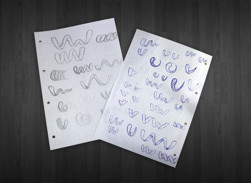
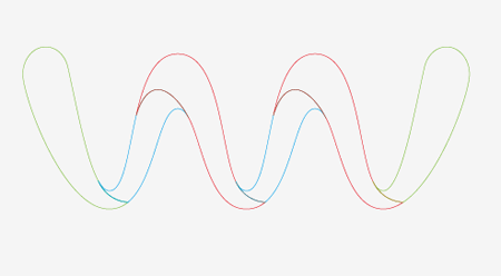
I started work sketching out my ideas for the logo, my main focus for the graphic of the logo was to display the letters V and W in a creative way that could be seen as an abstract mark, but also recognisable as the letters under closer inspection.
After conducting a little research, it occurred to me that the ribbon is a widely recognised symbol of life, so I concentrated on drawing up a ribbon that flowed and twisted into the shapes of letters V and W. The two styles that stood out were the straight/folded effect and the smooth/curling version, both of which represented the same message but in different visual styles.
Logo Concepts
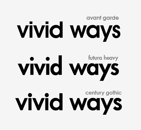
The logos graphic were then drawn up in Adobe Illustrator and experiments were conducted on the appropriate type styles. During the project commencement an example of a font was given, which I managed to identify as Century Gothic. Being a standard Windows font, I decided to compare it to two classics with similar letterforms: Avant Garde and Futura. I was expecting to go ahead with Avant Garde, but when placed side by side Century Gothic actually looked the nicest. I felt the letter S of Avant Garde and Futura was way too thin for the logo.
Logo Concepts
Colour wise, blue was an appropriate choice with it representing mind, body, confidence and intelligence in colour theory. It was also used well in the website design mockup.
Another idea for the colour of the logo was to take inspiration from the word vivid, and use a complete spectrum of colour. Combining both these colour concepts with subtle shading also helped boost the impact of the graphic with a three dimensional appearance.
The VW wave is awesome, you really nailed it!
I totally love the Vivid Ways wave. It captures everything about the brand I'd hope for, so thank you.
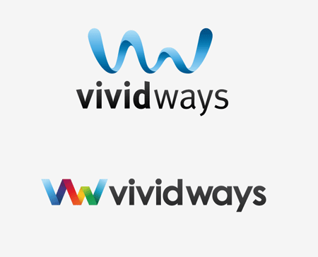
Concepts were supplied to Scott and Jon and great feedback was received. Concept A with the smooth wave was the preferred graphic, but it was asked if it could be tried with the colouring and font choice of Concept B.
Vivid Ways Logo
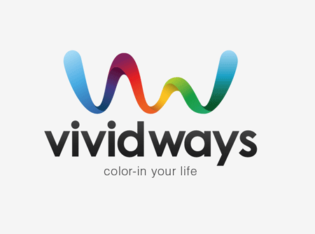
The final logo combines the strong waving graphic and vivid colour scheme and the smooth shapes of the typeface making for quite an impactful design.

Creating the Logo in Illustrator

With this background knowledge in mind, let’s take a look at the technical side of the design and see what processes are used to create this graphic in Adobe Illustrator.
Logo Sketch
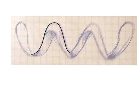
As previously mentioned, the logo started out as a bunch of sketches, these were developed on paper and the designs I was happy with were scanned in.
In Adobe Illustrator the image was placed on a locked layer, the outline of one of the peaks was traced and taken to one side. It was important not to trace the sketch entirely because there wouldn’t be any accuracy, instead the elements were laid out to specific measurements to ensure the logo would look good even at large sizes.
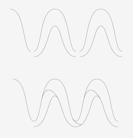
The peak outline was then copied and pasted, then moved to the side until the lines connected.
The paths were then edited with the Scissors Tool, and joined in specific places to make solid shapes out of each segment.
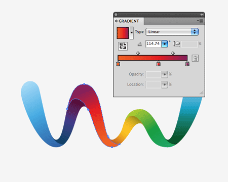
With the wave then being made up of individual shapes, Gradient colour fills could then be added. Blending any old colour samples just doesn’t work – the result is a muddy brown. Colours must be taken in their natural order in the spectrum (think rainbows or the colour wheel).
The range started with blue, which faded to purple, to red, to orange, to yellow, to green and back to blue.
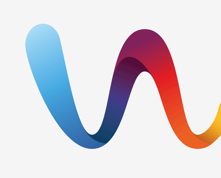
To give the three dimensional impression extra black was added to the areas of the ribbon that spiralled over, giving the impression that a soft shadow was being cast. This last touch is what really helps the graphic stand out.
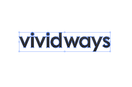
The chosen font was also laid out. This was edited slightly by reducing the tracking and carefully kerning the letters to give equal spacing on either side. The gap between the words was closed up slightly to pull the words into more of a combined mark.
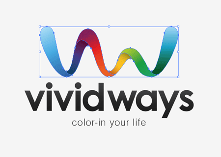
The logo graphic and type were then combined, the flowing line of the graphic seemed to fit quite well into the natural shape of the text when sat in a vertical layout.
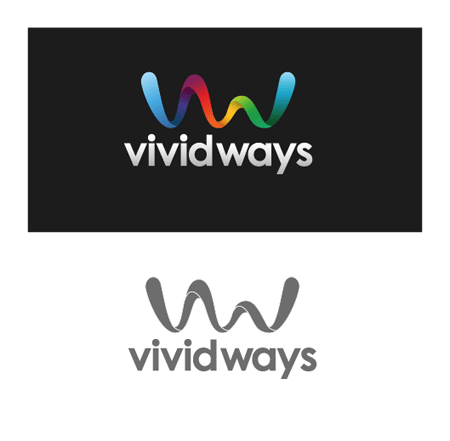
The final logo was then developed into a few secondary variations such as being reversed out of a dark background, and reproduced using a single colour for use in specific circumstances.
Vivid Ways Logo

Tuesday, May 29, 2012

Create Opera Logo 3D in Illustrator

0 comments

This is what you’ll be creating:

preview

Step 01

Create a 255 by 255px document. First, turn on the Grid (View > Grid) and the Snap to Grid (View > Snap to Grid). Next, you’ll need a grid every 5px. Go to Edit > Preferences > Guides > Grid, enter 5 in the Gridline every box and 1 in the Subdivisions box. You can also open the Info panel (Window > Info) for a live preview with the size and position of your shapes. Do not forget to replace the unit of measurement to pixels from Edit > Preferences > Unit > General. Al these options will significantly increase your work speed.

Step 02

Let’s start with the Rectangle Tool(M). Create an 190 by 220px shape, fill it with any color and remove the stroke. Select this fresh shape and go to Effect > Stylize > Rounded Corners. Enter a 110px radius, click OK then go to Effect > Warp > Fisheye. Drag the Bend slider at 20%, click OK then go to Object > Expand Appearance.

Step 03

Continue with the Ellipse Tool(L), create a 70 by 180px shape and go to Effect > Warp > Fisheye. Drag the Bend slider at 30%, click OK then go to Object > Expand Appearance.

Step 04

Select the two shapes created so far and add a copy in back (Control + C > Control + B). Turn off the visibility for these fresh copies, you will need them later. Select the remaing, visible shapes and click on the Minus Front button from the Pathfinder panel. Fill the resdulting shape with R=224 G=20 B=72.

Step 05

Select the shape created in the previous step and go to Effect > 3D > Extrude&Bevel. Enter the data shown in the following image, click OK then go to Object > Expand Appearance.

Step 06

Let’s focus on the Layers panel. You should find a simple group. Click on the little arrow icons until, find the Clipping Paths (pointed by the arrows in the following image) and delete them all. Now, select the shapes shown in the first image, click on the Unite button from the Pathfinder panel and fill the resulting path with R=131 G=5 B=42. Fill the remainging shape with R=224 G=20 B=72. In the end you should have four shapes in your Layers panel, two visible and two invisible.

Step 07

Select the large, visible shape and go to the Appearance panel. Open the fly-out menu and click on Add New Fill. This will add a second fill for your shape. Select it and use the linear gradient shown in the following image. The yellow zero from the gradient image stands for Opacity percentage. This means that you need to select the gradient slider and lower its opacity to 0%. Next, add a simple stroke for your shape and select it from the Appearance panel. Make it 5pt wide, align it to inside, set its color at R=255 G=255 B=255 and lower its opacity to 5%. Finally, reselect the entire path and go tot Effect > Stylize > Inner Glow. Enter the data shown below and click OK.

Step 08

Pick the Rectangle Tool(M), create two squares (50 by 50px) and place them as shown in the first image. Fill the top shape with black and the bottom shape with white. Grab the Direct Selection Tool(A) and focus on the black shape. Select the two, bottom anchor points and go to Object > Path > Average. Check Both then click OK. This will turn your square into a triangle as shown in the second image. Move to the bottom square. Again, using the Direct Selection Tool(A), select the top anchor point and go to Object > Path > Average. Check Both then click OK.

Step 09

Select the two triangles made in the previous step and go to Effect > Blur > Gaussian Blur. Enter a 7px radius, click OK then group these two shapes. Select the small, "O" shape and make a copy in front (Control + C > Control + F). Bring this copy to front (Shift + Control + ] ) and fill it with white. Select it along with the group and go to the Transparency panel (Window > Transparency). Open the fly-out menu and click on Make Opacity Mask. In the end your illustration should look like in the fourth image.

Step 10

Turn the large,oval shape (made in the fourth step) back to visible. Fill it with none and add a 0.75pt, black stroke. Align it to outside then go to Object > Expand Appearance. Fill the resulting shape with the linear gradient shown in the second image.

Step 11

Reselect the large "O" shape and make a copy in front (Contro + C > Control + F) then grab the Ellipse Tool(L), create a 190 by 125px shape and place it as shown in the second image. Select this new shape alonw with the fresh copy and click on the Intersect button from the Pathfinder panel. Fill the resulting shape with the linear gradient shown in the fourth image and lower its opacity to 80%.

Step 12

Turn the small,oval shape (made in the fourth step) back to visible. Fill it with none and add a 1pt, black stroke. Align it to outside then go to Object > Expand Appearance. Fill the resulting shape with the linear gradient shown in the second image, lower its opacity to 50% and bring it to front (Shift + Control + ] ).

Step 13

Disable the Snap to Grid (View > Snap to Grid). Select the large "O" shape and make two copies in front (Shift + Control + ] ). Select the top copy and hit the down arrow once. Reselect both copies and click on the Minus Front button from the Pathfinder panel. You will gret a group with two thin shape. Remove the bottom shape (pointed by the arrow in the third image) then select the remaining shape. Go to the Appearance, remove the stroke, the effect and keep only one fill. Make it white and lower its opacity to 50%.

Step 14

Reselect the large "O" shape and make two new copies in front (Shift + Control + ] ). Select the top copy and hit the up arrow once. Reselect both copies and click on the Minus Front button from the Pathfinder panel. Again, you will gret a group with two thin shape. Remove the top shape (pointed by the arrow) then select the remaining shape. Remove the stroke, the effect and keep only one fill. Set its color at R=120 G=5 B=24.

Step 15

Pick the Ellipse Tool and click on your artboard.. Enter 10 in the width box and 2.5 in the height box then click OK. This will create a 10 by 2.5 px shape. Fill it with R=237 G=166 B=168 and place it as shown in following image. Make a copy of this and fill it with white then rotate it and place it as shown below.

Step 16

Focus on the shapes made in the previous step. Select the pink shape made in the previous step and go to Effect > Blur > Gaussian Blur. Enter a 2.5px radius, click OK then select the white shape and go to Effect > Blur > Guassian Blur. Enter a 3px radius then click OK.

Step 17

Finally, re-enable the Snap to Grid (View > Snap to Grid) then pick the Ellipse Tool(L). Create a 90 by 25px shape and fill it with R=71 G=5 B=42 then send it to back (Shift + Control + [ ) and go to Effect > Blur > Gaussian Blur. Enter a 5px radius, click OK and you’re done.


Final

Now your work is done. Here is how it should look like.

Colorful Balls Text Effect in Illustrator

0 comments
In this tutorial I’ll teach you how to create a Colorful Balls Text Effect/Typography Poster using Adobe Illustrator to create the text, and Photoshop to add some finishing touches. We’ll be going through some basic Illustrator & Photoshop methods to create this fun & colorful text effect.

Final Result

Illustrator

1. Create a new document that’s 600×300 pixels. Using a thick/bold font, write out your letters in black. Lock the letter’s layer and create a new layer.

2. Using the Ellipse Tool draw a circle while holding down the shift key (to keep the shape perfect). Duplicate the circle 3 times by dragging the circle away while holding down the ALT Key. On each circle put on a different colored gradient like below.

3. Draw a smaller circle with the Ellipse Tool again and put in the gradient below. This will create a nice light glare on the ball.

4. Duplicate the light glare and place it on the other circles.

5. Next select each ball with the light glare and click on the Merge button in Pathfinder to merge the 2 shapes together.

6. Now comes the most time consuming part! Select each of the balls and duplicate them over the letters, changing the size of them by selecting the balls with the Selection Tool and dragging a corner down or up while holding down the shift key. If you want to rotate them so the light glare is in a different direction, select them with the Selection Tool and rotate a corner.
Do this with all the colored balls until the black letters are hidden.

7. Remove the black text layer from view, and save the document.

Photoshop

8. To add in some finishing touches to the text effect, create a new document in photoshop with the size of your choice with a white background (I’m using 700×400 pixels). Double click on the background layer to unlock, then again to go into Blending Options and put in the Gradient Overlay below:

9. Create a new layer and select a fairly large soft edged brush. Using the same colours as the colorful balls, draw on some colourful spots around the canvas and set the Opacity to 10%.

10. Open the Text Effect Illustrator document and copy/paste the text onto the canvas. To make the text smaller press CTRL+T and drag the top corner down while holding down the Shift Key (to keep the image perfect).

11. Double click on the text effect layer to go into Blending options and put in the following Outer Glow.

12. Duplicate the text layer by dragging it to the new layer icon, press CTRL+T and flip the duplicate layer down for the reflection.

13. Click on Add Mask Layer to place a mask on the duplicate text. While on the mask layer, select a soft edged black brush & erase the bottom of the text. Make the Opacity 14% to finish off the reflection.

14. Create a new layer & select a 2 px solid white brush. Hold down the Shift Key and draw a vertical & horizontal line. Place a Mask over the layer like in step 13 and erase the edges of the white lines over a light glare for a nice light effect. Duplicate the light lines and place them over a couple of other light glare areas. If you want to rotate a layer press CTRL+T and rotate an edge.

Final Result