


Professional logo designers know that there is much behind a logo than simple text with an image or symbol thrown on it. They want to make something unique, something that is exceptional, something with a deeper meaning. You see many logos everyday, but have you ever wondered what they actually mean? Have you noticed the details and meanings hidden in them. Well, I think the answer would be no, thanks to our extremely busy lives.
So today we have a list of 27 Popular Logos With Hidden Meanings. These famous logos have hidden meanings and secrets, so this is your chance to know what they are. Some are quite obvious, while some are not. Check them out, you might be surprised on what you find!
Formula 1 Logo
At first, this logo might not make much sense. But if you look closely, you’ll see the number 1 in the negative space between the F and the red stripes. I also love how this logo communicates a feeling of speed.
Fed Ex
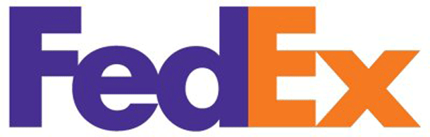
This one is quite famous. Simply look between the “E” and the “x”, yes, there is a white space which makes an arrow. The arrow represents speed and precision.
NBC
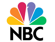
People over 50 would know this one. There is a peacock in the middle, in white color. It was quite obvious years ago, but now the peacock is a bit tough to spot.
Goodwill

This logo is very common, and we see it a lot. But have you ever noticed that the “g” in “goodwill” and the smiling face look quite similar? Yes, they are same!
Big 10 Conference

There are now 12 schools in the Big 10, but when the logo was designed there were 11. The conference didn’t want to change its name, so they added the logo magic! You can see two 1′s by the each side of ‘T’.
Baskin-Robbins

Baskin-Robbins is famous for having 31 flavors, one for each day! So they have incorporated the ’31′ in pink color in their ‘BR’.
ED

ED stands for an Italian electric company named Elettro Domestici. Their logo was designed by Gianni Bortolotti and it has since become quite known in the design community.
Body Wisdom Logo
It is a logo design for a high end day spa… the hands effectively convey relaxing massage integrated with the proximity of the “owl eyes” to clearly say “wisdom”.
Carrefour

Carrefour is the name of a French international hypermarket chain. It means “intersection” in English. If you look at the logo you would see two arrows pointing at opposite directions, but notice closely, the white space in between the two logos actually makes a big “C”. Cool, right?
Mammoth

Mammoth is a popular ski resort in California. It’s logo has a big “M” but it can also be interpreted as mammoth, a mountain, and a ski trail.\
Northwest Airlines

This old Northwest Airlines logo is has “N” and “W” both constructed from the same image. But if you look closely, you would find a compass in there, which points towards the Northwest direction.
The Pittsburgh Zoo

This one is an awesome one. You can see the tree, but the sides of the tree have a white space, which makes up a monkey and lion staring each other. A perfect logo for a zoo — don’t you think?
Sun Microsystems

Sun Microsystems was acquired by Oracle in 2010, but its logo was one of the most famous in the industry. It was created by Vaughan Pratt. It is a really amazing logo, as you can read the word “sun” from any direction.
The Atlanta Falcons

The Atlanta Falcons logo is a really cool looking bird, which also makes the shape of a big letter “F”.
LG

Can you see any resemblance with Pac Man? Just simply do a little tilting and shift the “nose” upwards. South Koreans are amazing.
Via Rail Canada

This logo is very common in the far north, but have you ever noticed that the logo itself depicts a railroad?
Amazon
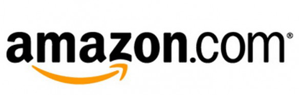
Amazon logo is not only smiling but notice that the arrow goes from “a” to “z”. Yup, Amazon has everything from A to Z.
Milwaukee Brewers

Milwaukee Brewers is yet another sports team with a great logo. The glove is actually made up of the letters “b” and “m”.
Tostitos

We love their chips and dips, and they have also got an amazing logo. You can see the fiesta going on in their logo, with the two t’s and a bowl of dipping sauce that dots the “i”.
Sony Vaio

Sony Vaio is a famous Sony sub-brand, and its logo also has some hidden details. The letters “V” and the “A” form an analog signal while the letters “I” and the “O” represent the binary digits 1 and 0.
London Orchestra

This one may look simple, but when one notices closely you can see the orchestra conductor in it.
Hersheys

Hershey’s kisses logo has to be big for you to notice it, but just see what lies between the “K” and the “I”.
Hope for African Children Initiative

In this logo you can see a really intelligently drawn map of Africa. The continent is formed out of the white space that separates a child from its guardian.
Toblerone

We all know that Toblerone was started in the city of Bern, Switzerland. But what most of us don’t know is that city is famously associated with bears. But why am I telling you all this? Just simply look closely at Matterhorn Mountain and you’ll know why? You found the bear, right?
Tour de France

Can you see the biker in that logo? No? Well, see how “o”, “u”, and “R” all come together along with the yellow dot to form a biker. Cool, right?
Washington State University

The cougars’ logo contains their mascot which is composed of the three letter acronym for their school.
Roxy

When Quicksilver started Roxy it wanted to break into the untapped market for female surfers. So you can see the Roxy logo is actually made from two back to back Quicksilver logos.


0 comments:
Post a Comment
Note: Only a member of this blog may post a comment.